Visual identity
STIEBEL ELTRON’s visual style is characterised by authenticity and authority. It has a natural and relaxed feel with a documentary-like style, while the colour scheme is warm and contrasting, but not too bright. The images always convey a sense of authority, credibility, ease and innovation. Exaggeration and dramatisation are avoided. The photographic stylistic elements typical of STIEBEL ELTRON ensure the uniform visualisation of image content.
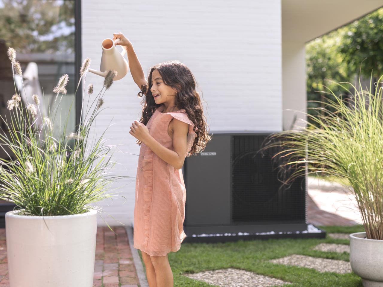
Our people photography
- relaxed
- content
- natural
- independent


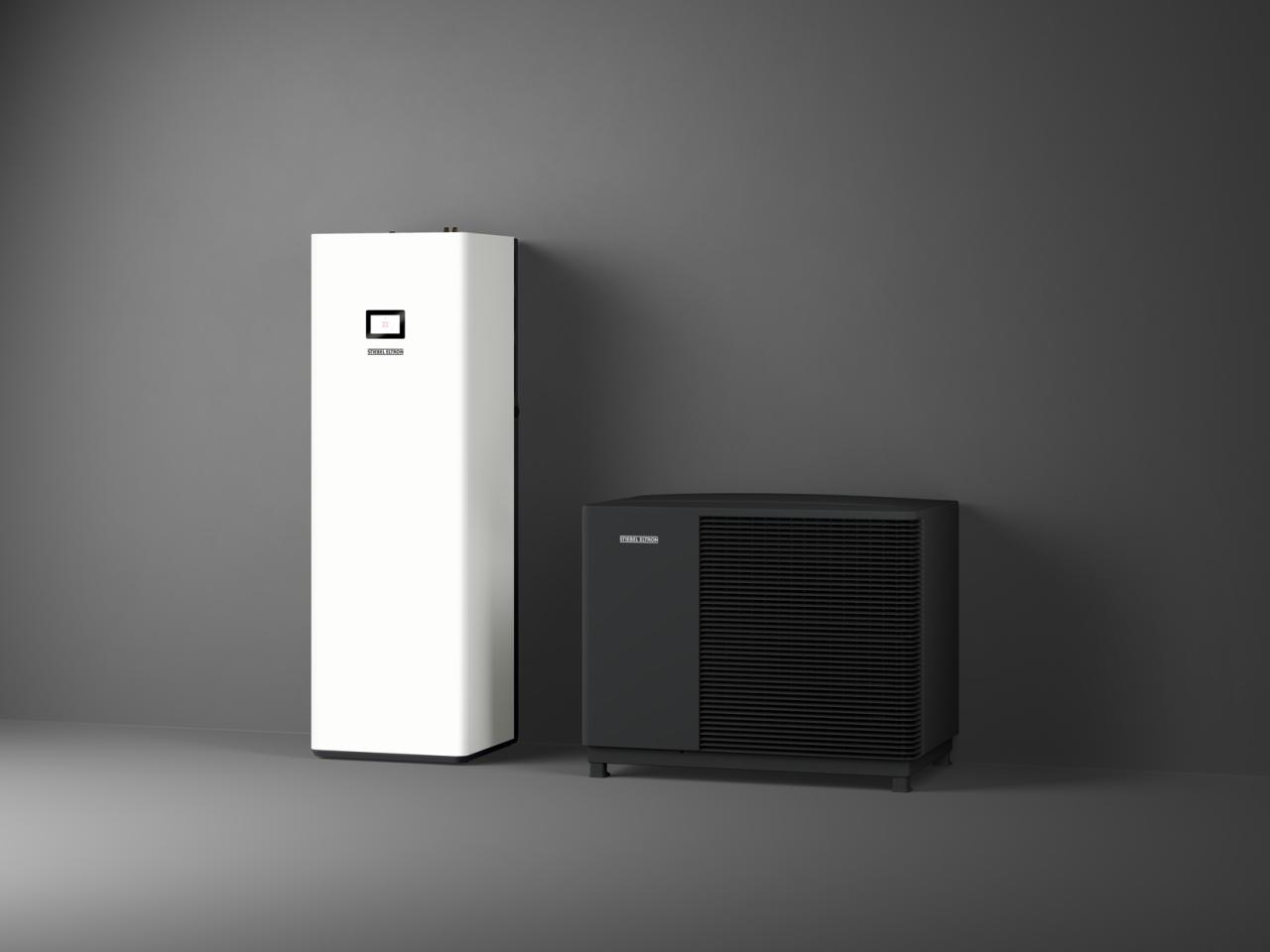
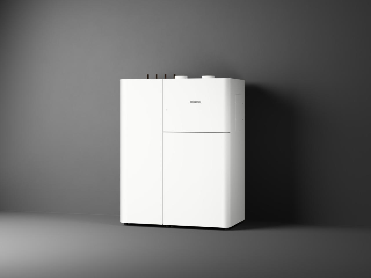
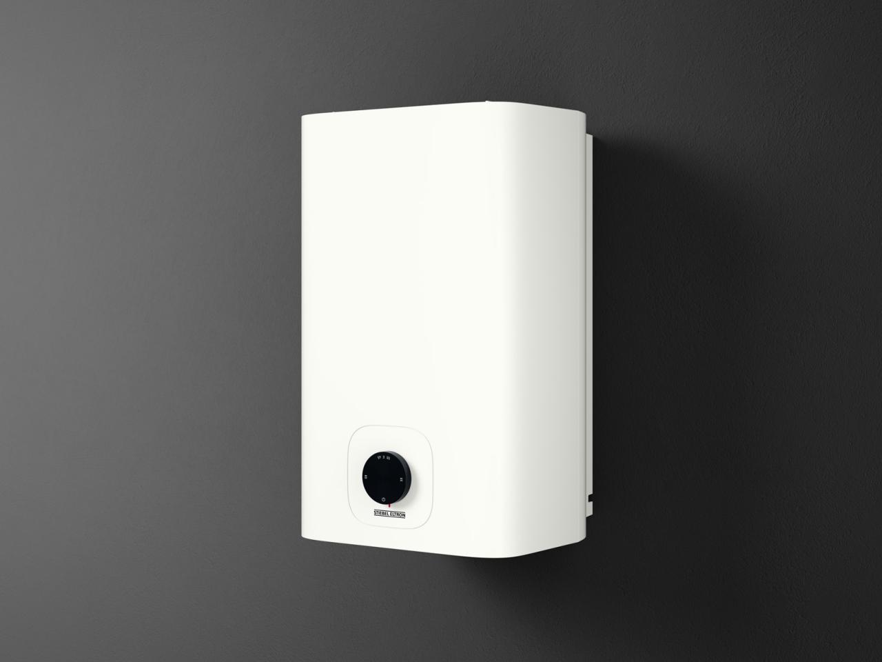
Our product shots
- reduced
- clear
- monolithic
- unmistakeable
Our in-site images
- modern
- uncluttered
- reduced
- forward-looking
- sustainable
- subtle
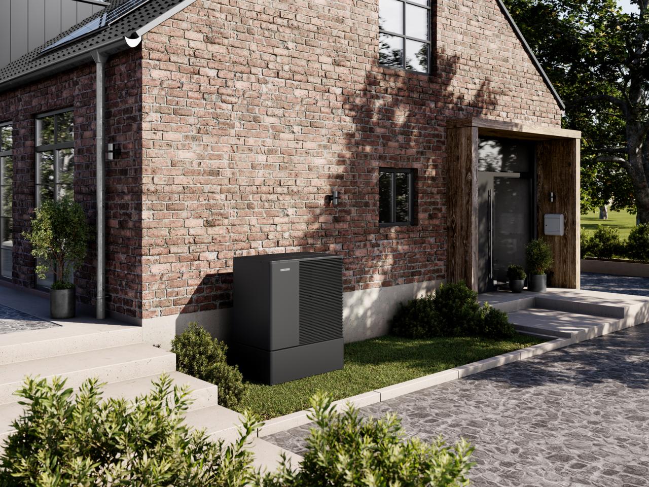
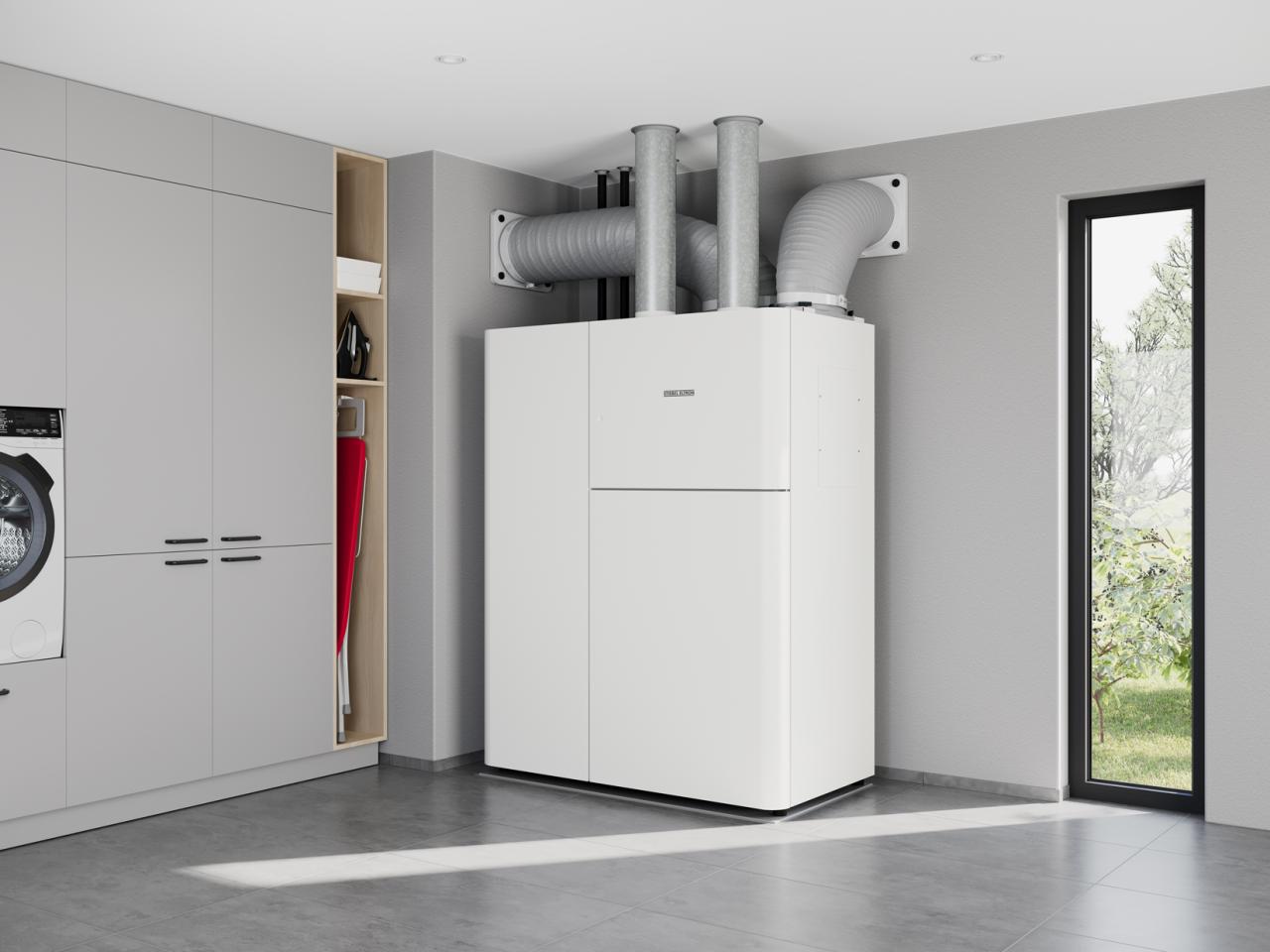
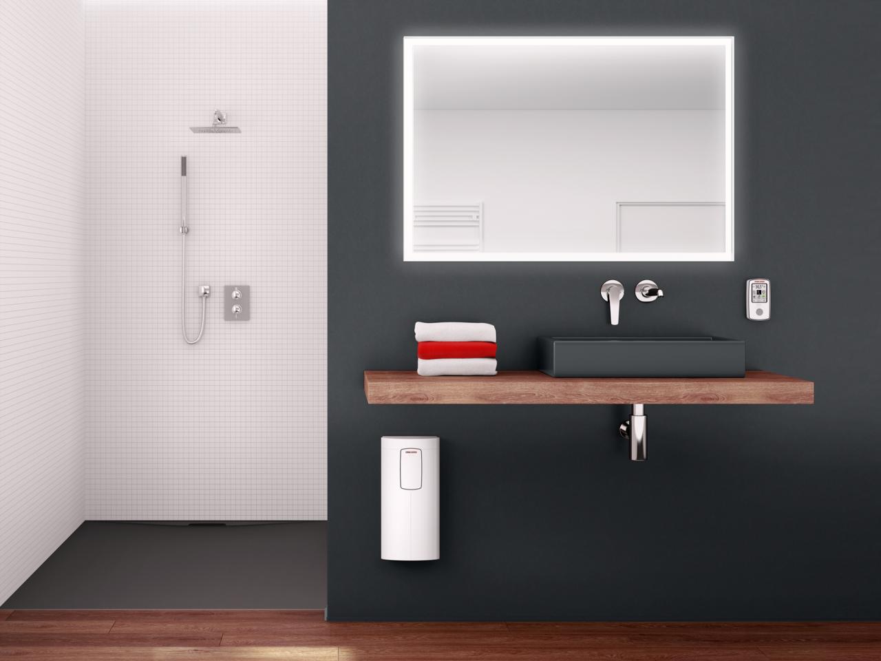
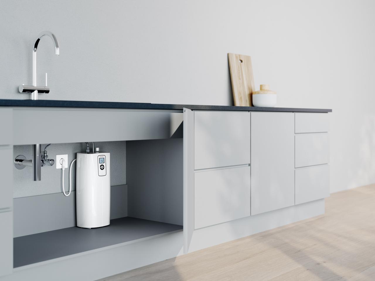
Illustration design
Illustrations and graphics are used as visual aids to convey complex content in a simple and vivid manner. They support a more comprehensible representation of services, functions, processes and other situations. In order to anchor the brand’s defining visual appearance, illustrations are always created in line with defined stylistic features.
Messages should be clearly and unambiguously conveyed using a direct and straightforward approach. Unnecessary decorative elements are avoided. Colour and contrast are intentionally used to ensure that the most important elements of each illustration catch the eye.
A consistent colour mood is important for recognition and clear brand identification. This is why the brand-defining primary colours serve as the basic colour scheme for our illustrations. The complementary secondary colour scheme is used for accentuated differentiation of the various illustrations and graphics, and of different topic areas.
Complexity
Degree of abstraction
The STIEBEL ELTRON illustration style is modern, clear, informative and to the point. Messages are quick and easy to grasp thanks to the use of simple metaphors and not too many details.
Shapes are simplified in both the flat design and perspective representations, and only include key aspects. However, the styling is not too banal or clichéd.
Level hierarchy
It is important to reduce complexity. The focus should always be on the key message. Additional background information is presented unobtrusively.
This creates two levels of information. Colour highlighting and stronger contrasts keep the focus on the key messages. Less contrast and fewer details are used for secondary information.
Types of illustrations
Topic illustrations
Topic illustrations vary greatly depending on the content. The same or similar shapes and elementsshould be repeated for greater continuity. People/avatars can be used in this category.
Operating principles
A technically correct aspect is the focus for operating principles. The same or similar elements and the same line thicknesses should always be used to ensure continuity in graphics. The numerical labelling inside circles is a defining element.
System layouts
System layouts may be shown in 2D or 3D, depending on the complexity of the content. A perspective representation is used to convey the spatial conditions more clearly.
Important
- The system is the focus (emphasis is created by using increased contrast and colour for differentiation)
- The scene is set using architecture with a simple layout and only the main features
- The building/architecture represents the second level of information (few details, little contrast)