The unique hallmark
The logo is the company’s most important distinguishing feature and as such, it must be considered unchangeable. If the logo is not used consistently, this detracts from its function and value. It is therefore important to use our company logo according to the same specifications at all times.
Minimum size
In the context of co-branding or very small depictions, the logo may have to be scaled down. To guarantee good readability, it must not be smaller than the minimum size.
Clear space
The proportions of the logo itself and the clear space around it are predefined and must be maintained regardless of size.
Slogan
The slogan should ideally occupy its own space but never without the logo present.
Not like this! Using our logo incorrectly.
The colour influences the look
The STIEBEL ELTRON brand colours are as consistently specified as the font, form and shape of the logo. Precise specifications in line with various standards allow the colours to be reproduced exactly the same every time. This means that the brand identity always has a uniform appearance in terms of its colours.
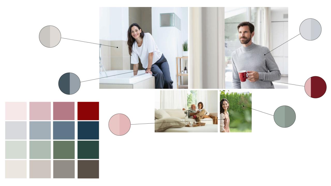
Differentiating by colour – our secondary colours
The power of typography
Everyone has their own signature. This applies to individual people as well as to us as a company. Using our corporate fonts promotes recognition of the brand and defines its identity.
F2F
Used for headlines, sublines and in exceptional cases where the typography has a special design function.
STEInfo Text Regular
Used for body text, maragin text and captions.
STEInfo Text Semibold
Used for emphasised text in exceptional cases.
STEInfo Text Bold
Used for sublines, awards and highlights.
